

ABOUT INCONDICIONAL STUDIO
We build authentic brands and projects, with the goal of transcending, generating emotions, and connecting with people.
Client-Centricity
IIncondicional is a creative studio specializing in branding, visual identity, and art direction for companies and projects worldwide. We build each brand from a solid strategic foundation, defining its purpose and direction. From there, we reinterpret codes from popular culture to transform them into a unique identity language. The result is coherent and impactful visual ecosystemsrecognizable and memorable capable of connecting and enduring over time.
Expertise
Incondicional es un estudio creativo especializado en la creación de branding, identidad de visual y dirección de arte para empresas y proyectos de todo el mundo. Construimos cada marca desde un origen estratégico sólido, definiendo su propósito y dirección. A partir de ahí, reinterpretamos códigos de la cultura popular para transformarlos en un lenguaje de identidad propio. El resultado son ecosistemas visuales coherentes y con impacto, reconocibles y memorables, capaces de conectar y perdurar en el tiempo.
1
Brand Strategy
We begin every project with clarity. Understanding your vision, your audience, and your competitive landscape to build a strong foundation.
2
Design with Purpose
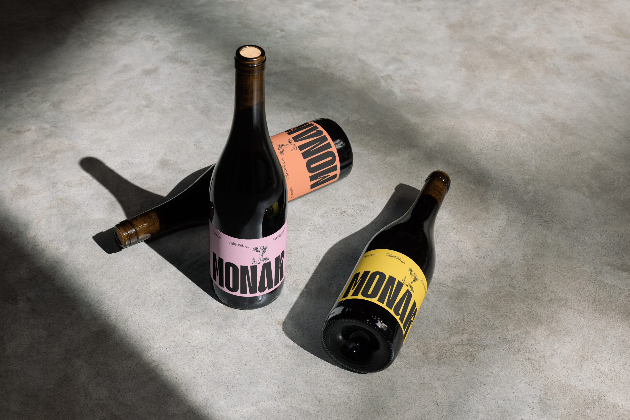
Our design process is driven by meaning, not just aesthetics. Every choice is made to resonate, engage, and communicate clearly.
3
Digital for Impact
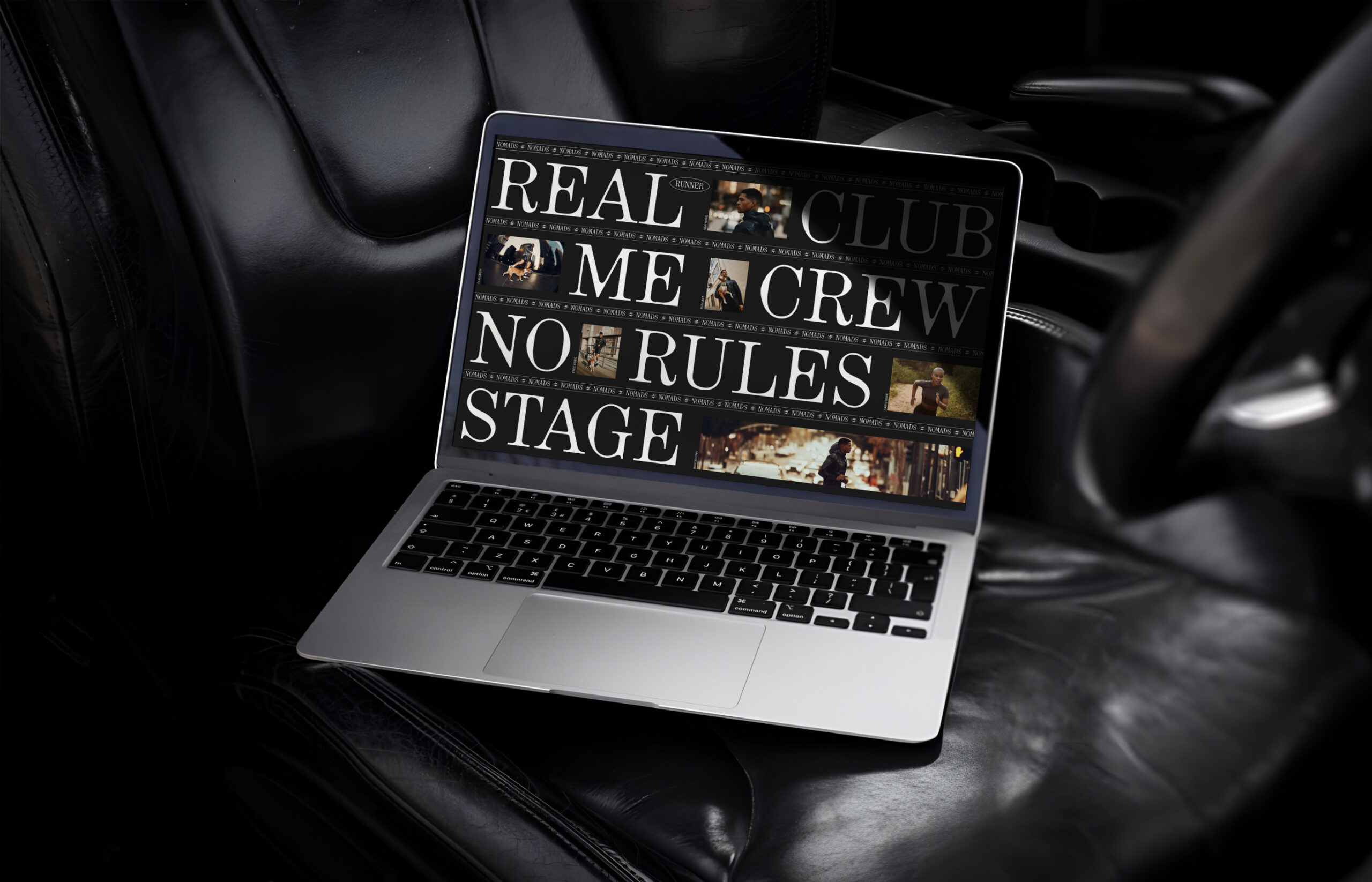
We craft with precision — translating ideas into functional, high-performing digital experiences built to stand the test of time.
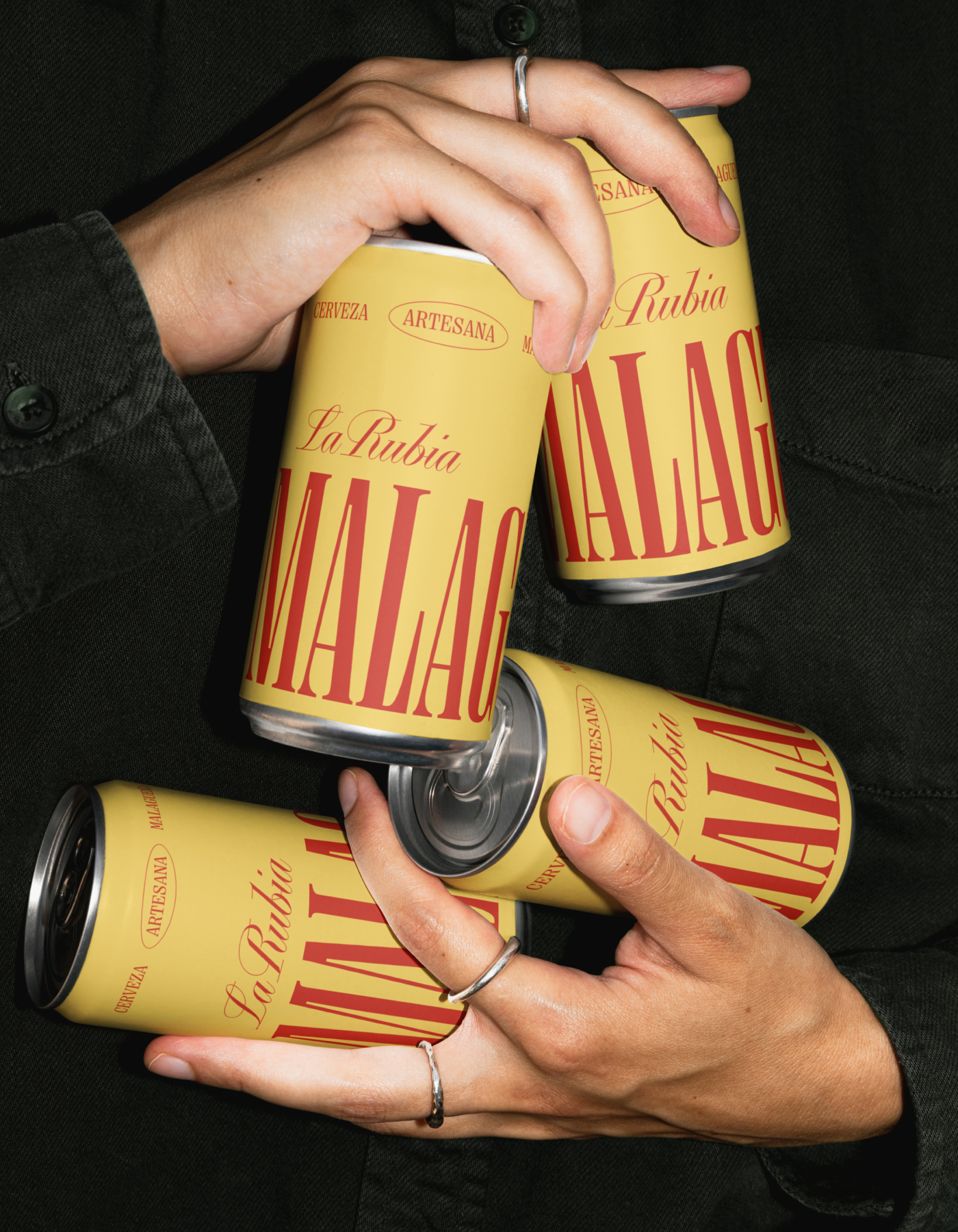
“Monak’s packaging, designed by Incondicional Creative Studio, is a great balance between playful and classic. The oversized block typography dominates the label, creating a striking visual hierarchy that’s hard to miss on a shelf. The layout stays grounded in traditional wine cues with its centered text and vintage markers, but the bold scale and unexpected colors make it feel younger and more conversational, signaling a brand that wants to invite drinkers in, not intimidate them.”